Me to We
Objective
The client, ME to WE company, is a social organization that provides ethically sourced and sustainable products. Part of the profit from the sales of the chocolates is used to ensure that children in Ecuador have access to education. Their chocolate bars are sold online and in World Market stores. The target audience is adults 20-70 years old, especially parents/ grandparents that want to treat their kids with a fun and playful chocolate and help other children at the same time.
Their packages are pretty and bright, but the hierarchy needs to be improved. During my research, I found that the potential consumers could not easily identify the name of the brand and were confused with the amount of information on the packages.
The objective was to redesign Me to We chocolate bars, highlighting their brand identity and making the products more attractive and easily identifiable.
Discovery & Ideation
Looking for dieline examples on Pinterest, I saw one tower package that reminded me of the shape of a pencil. This sparked my interest in the concept
of “educational objects” and the idea of making chocolate pencils seemed the most
interesting because it was playful, authentic, and fun at the same time.
My peers suggested that I should incorporate elements from the other concepts, to make the final product more interesting and unique. After some iterations and research, I decided
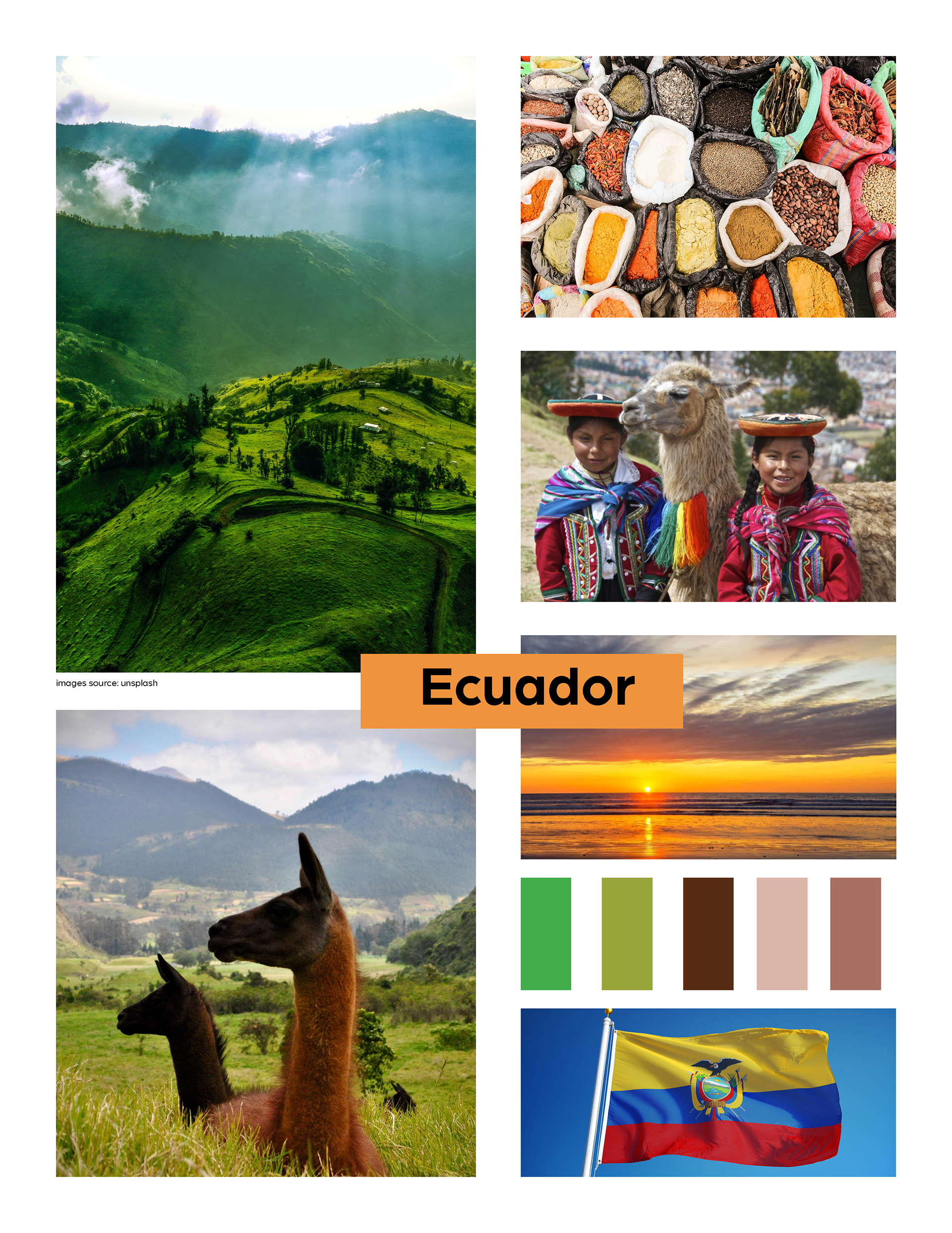
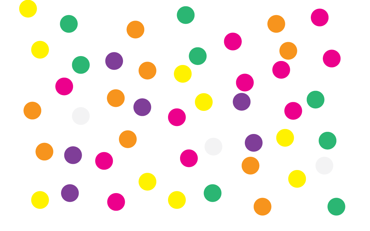
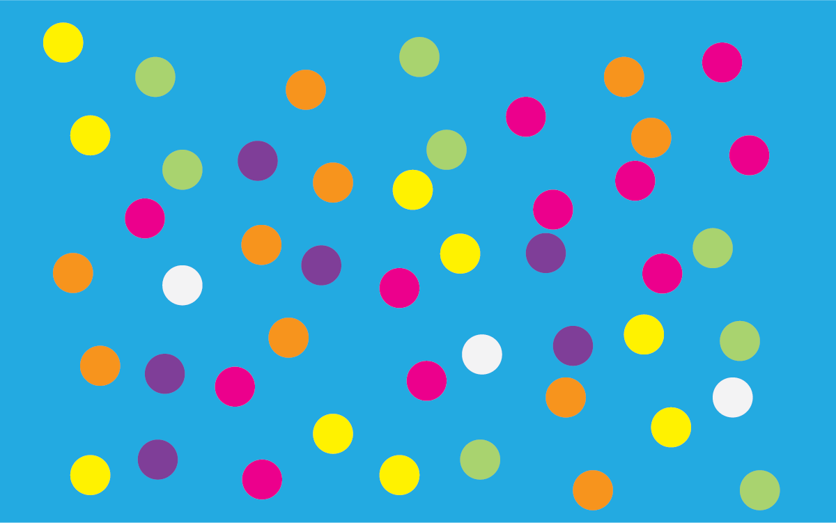
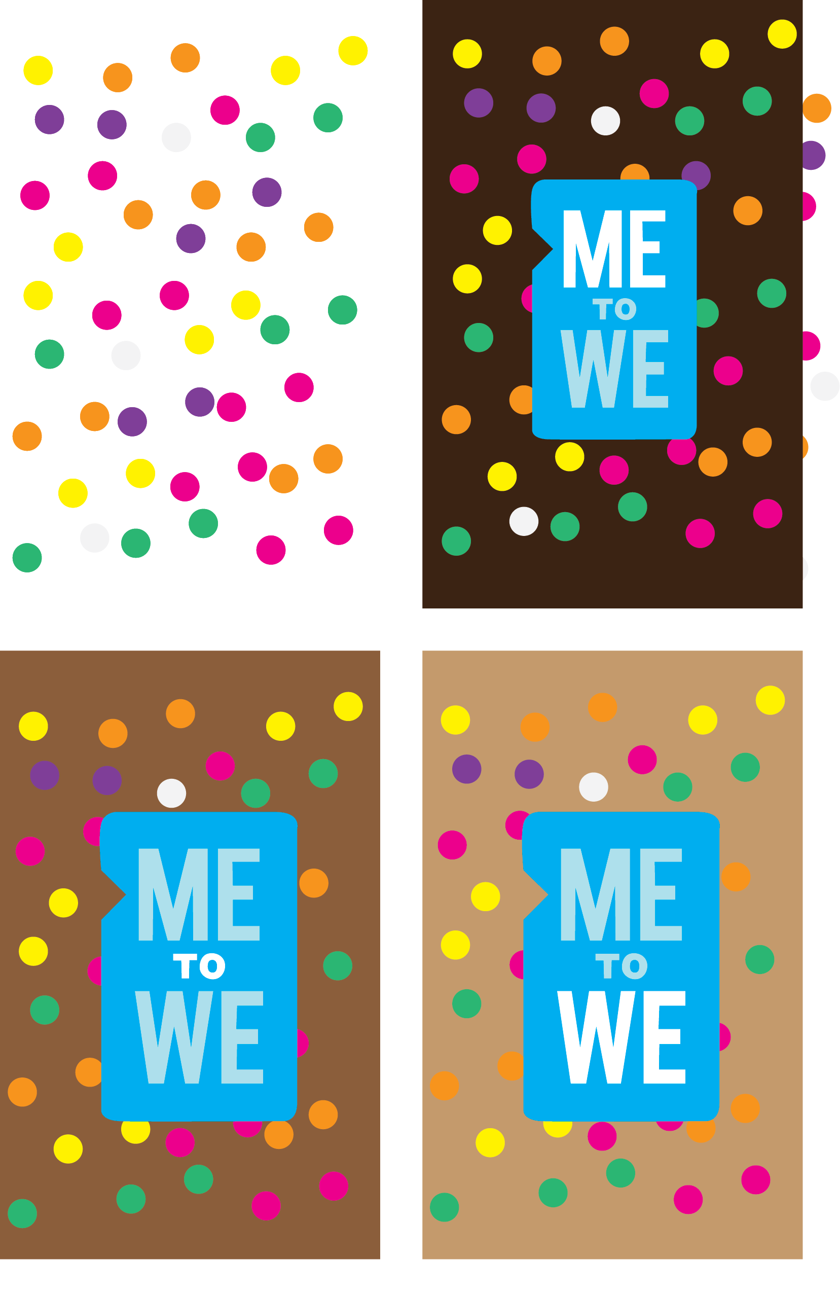
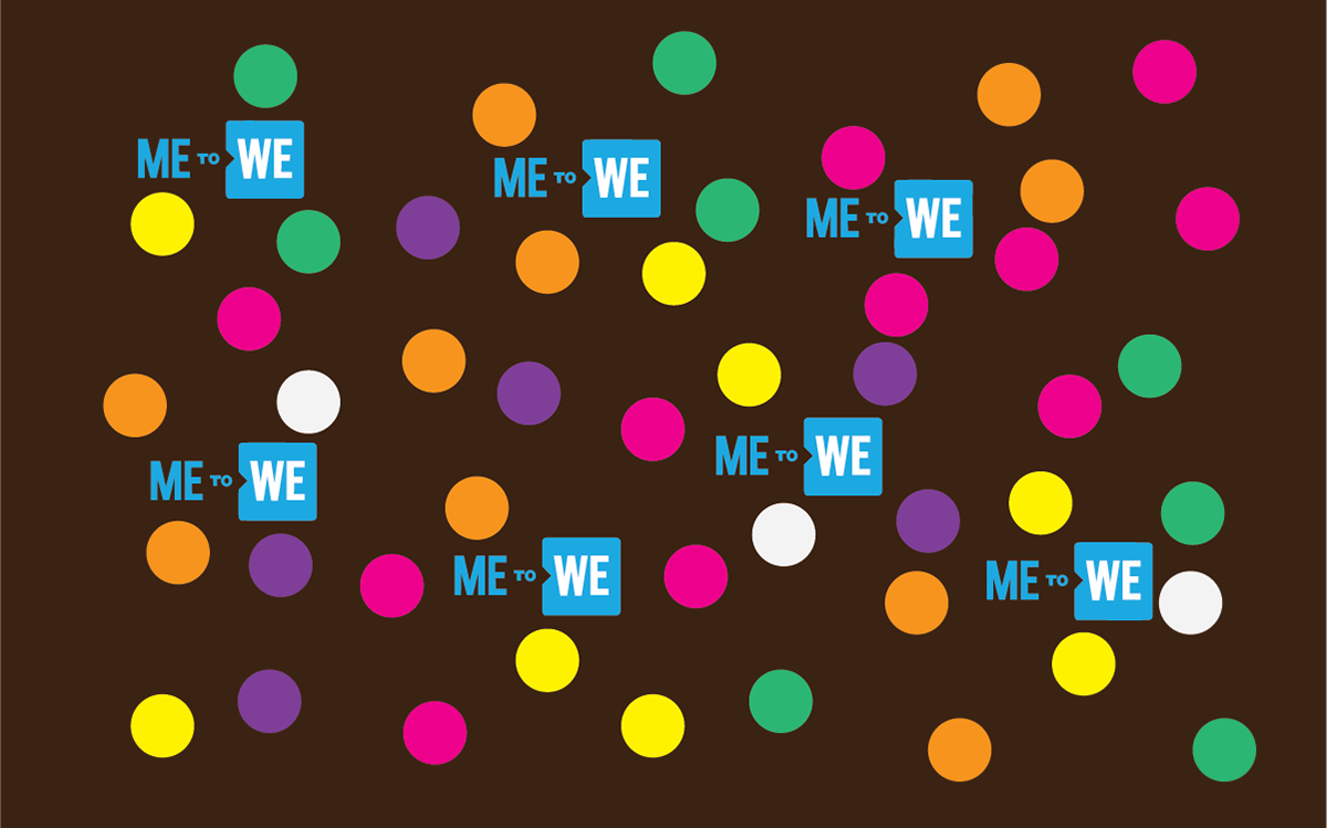
to incorporate vibrant colors from “Ecuador”, simple shapes, and a confetti pattern that refers back to the children’s theme.
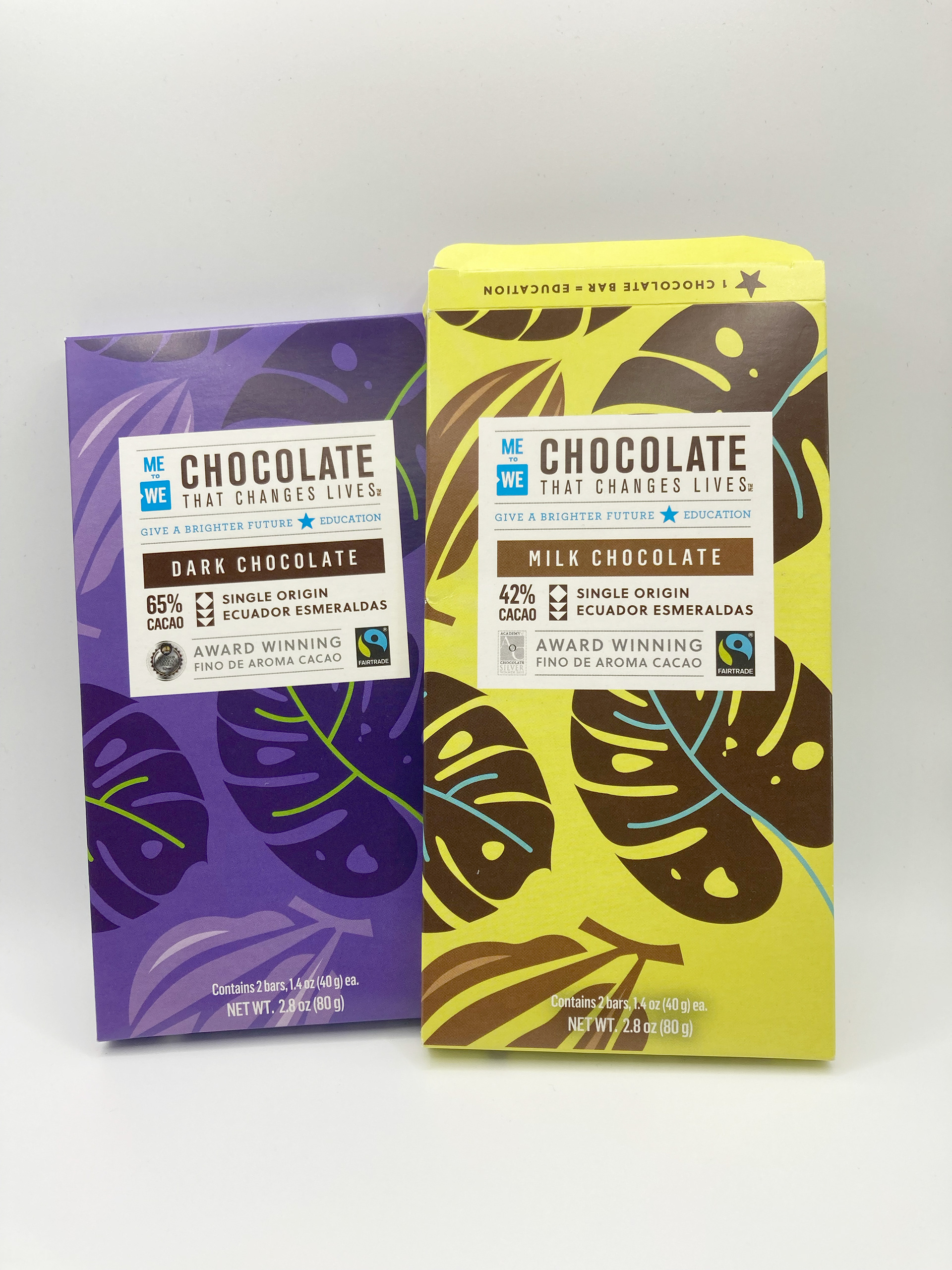
Me to We is a social enterprise that was founded in 2008, in Toronto, Canada, by brothers Craig and Marc Kielburger. The company sells sustainable, fair trade, and artisan-made products. Their slogan is “Helping you change lives through your everyday choices.”
Me to We chocolate is handcrafted with Fairtrade-certified cacao and it empowers cacao farmers in Ecuador and gives back to their families and communities by providing access to education.
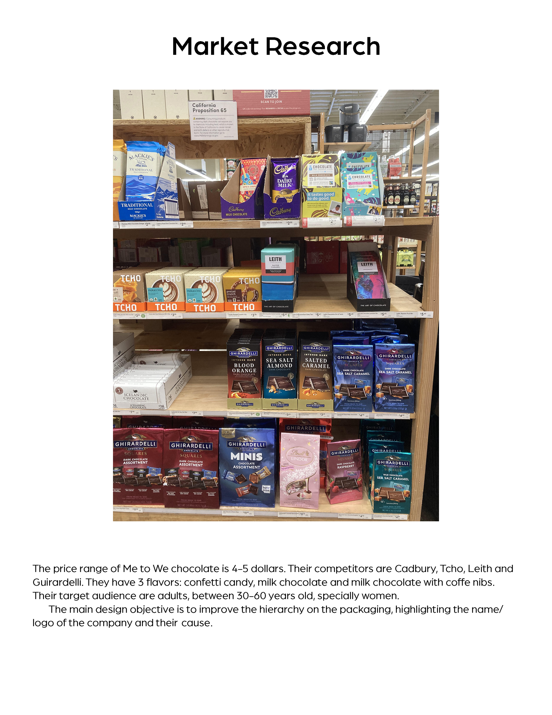
The price range of Me to We chocolate is 4-5 dollars. Their competitors are Cadbury, Tcho, Leith and Guirardelli. They have 3 flavors: confetti candy, milk chocolate, and milk chocolate with coffe nibs. Their target audience are adults, between 30-60 years old, especially women.The main design objective is to improve the hierarchy of the packaging, highlighting the name/logo of the company and its cause.
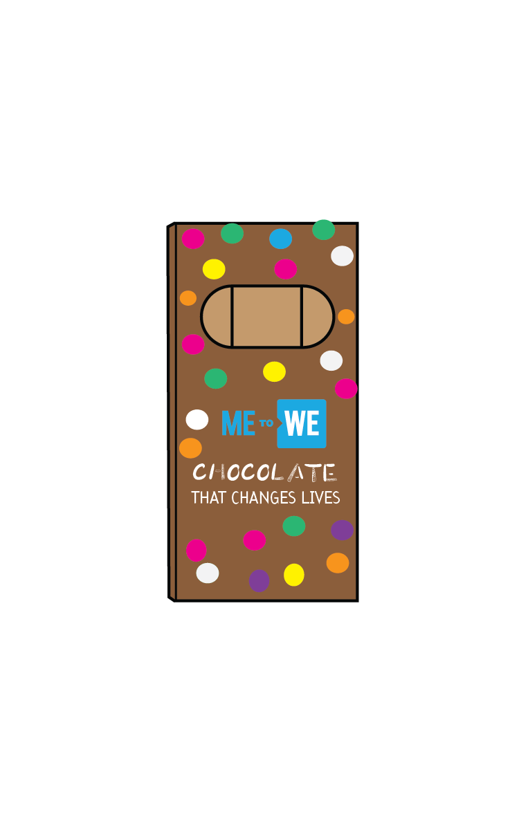
Before
Research
Mood board
Mood board
Mood board
Roles & Responsibilities During the project I performed the following roles: research about the brand, competitors, and market goals brainstorm/sketch create alternatives and select the best solutions make adjustments based on feedback received from peers construct prototypes test the measurements, evaluate the layout and make necessary changes.
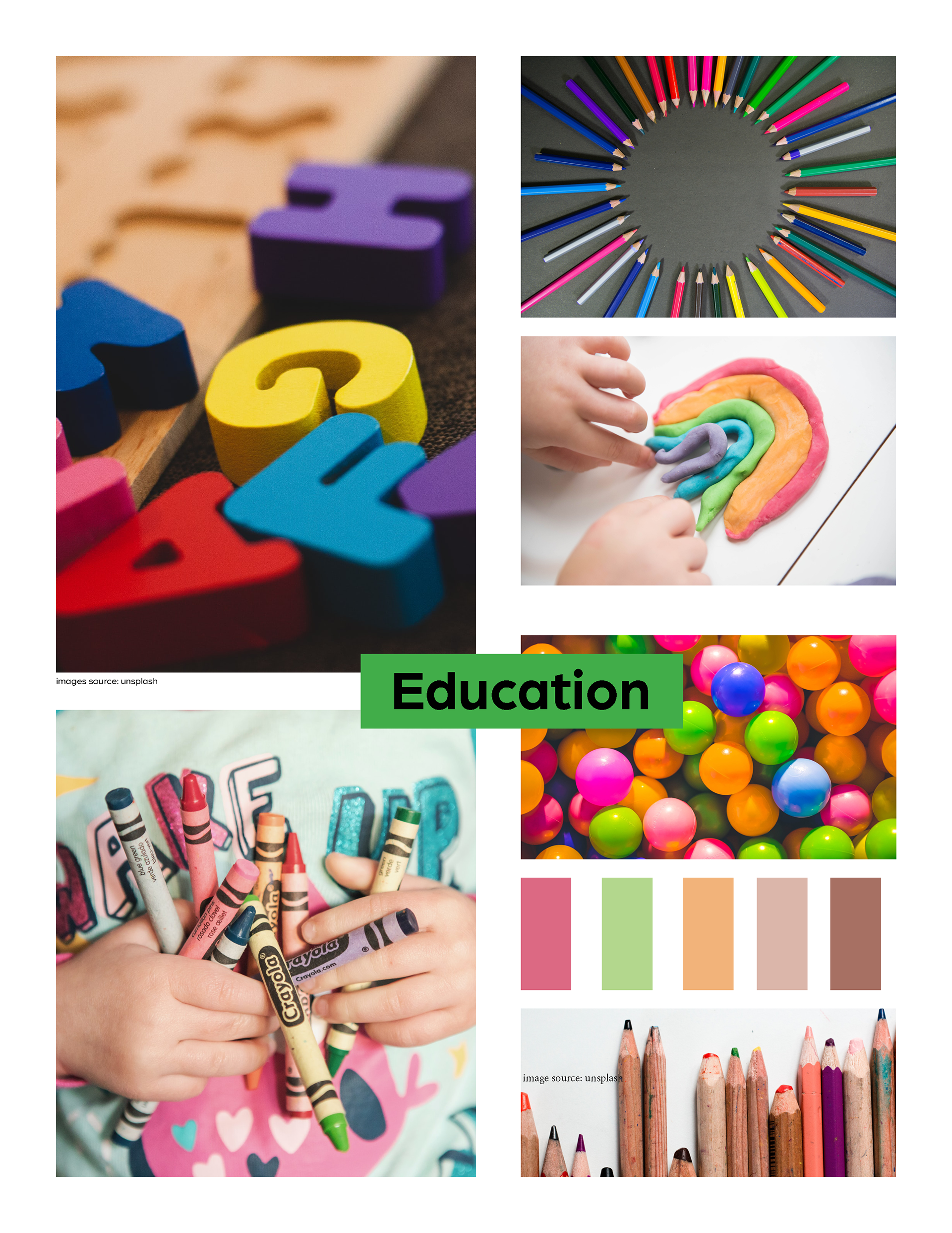
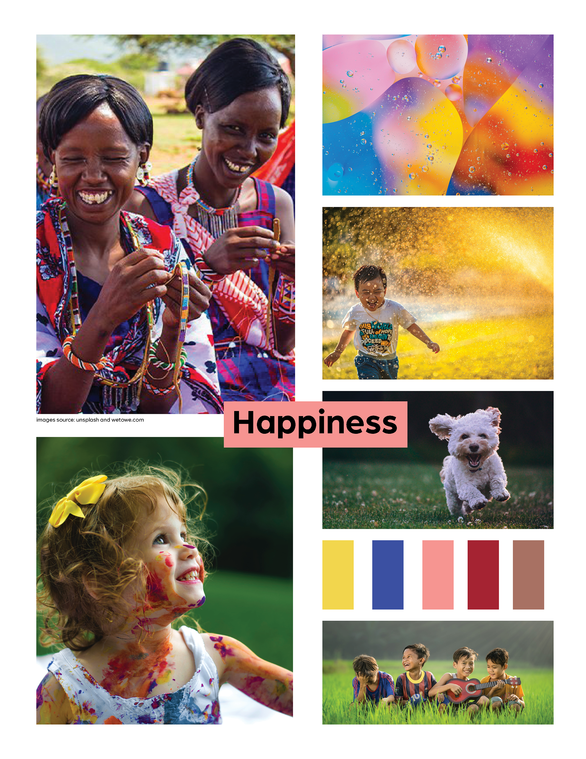
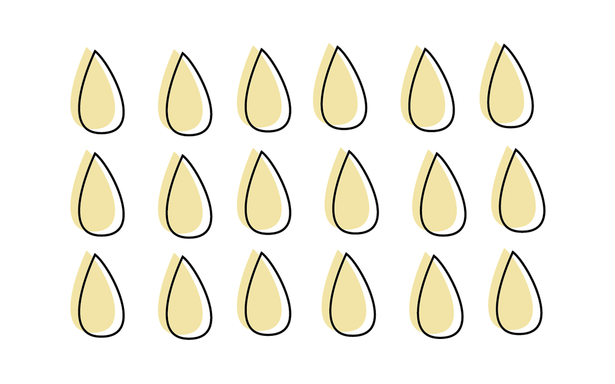
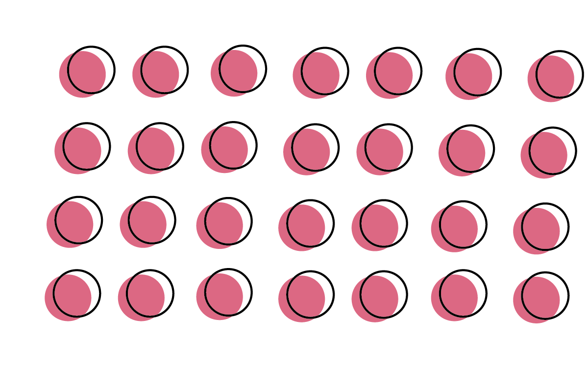
Explorations: During the tasting and brainstorming phases, 4 concepts stood out: happiness, kids' drawings, Ecuador’s vibrant and energetic culture, and educational objects, such as pencils, erasers, and notebooks.
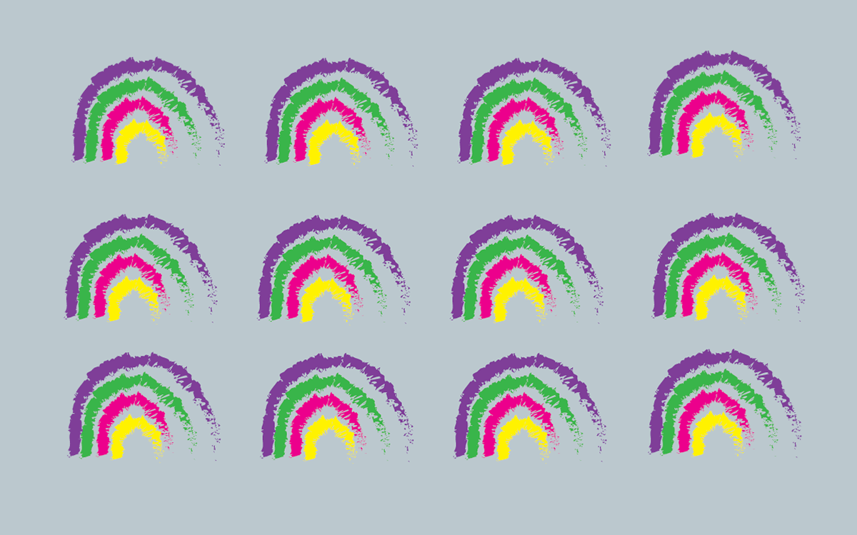
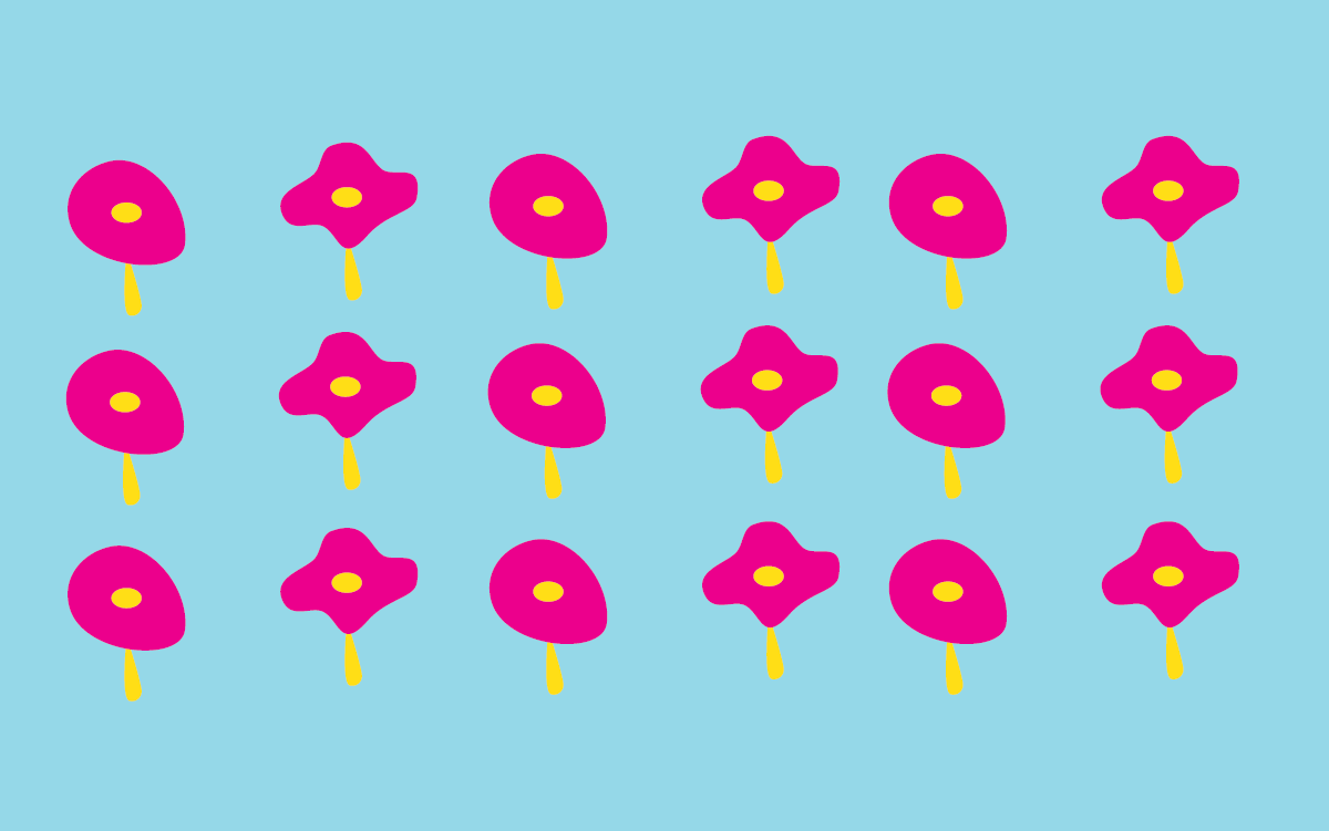
Pattern & Color exploration
Pattern & Color exploration
Pattern & Color exploration
Pattern & Color exploration
Pattern & Color exploration
Pattern & Color exploration
Pattern & Color exploration
Pattern & Color exploration
Pattern & Color exploration
Pattern & Color exploration
Pattern & Color exploration
Pattern & Color exploration
Pattern & Color exploration
Pattern & Color exploration
Pattern & Color exploration
Pattern & Color exploration
Pattern & Color exploration
Pattern & Color exploration
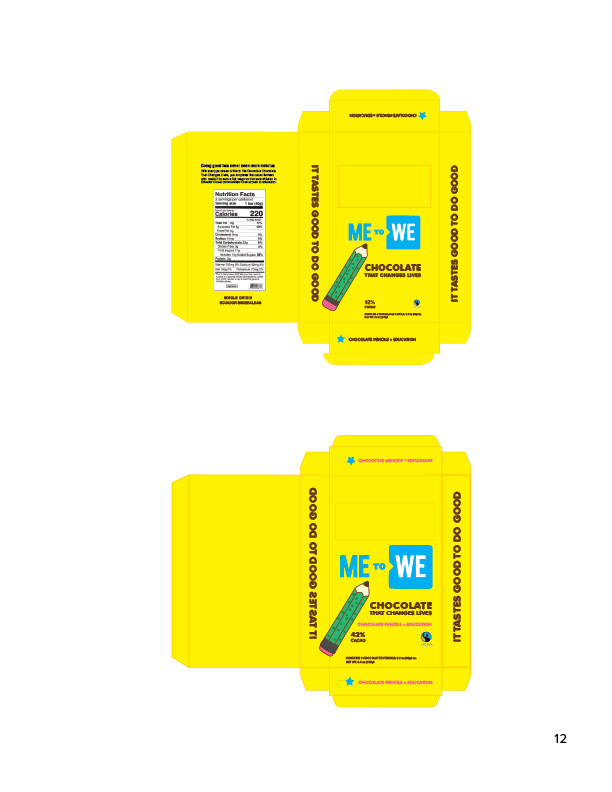
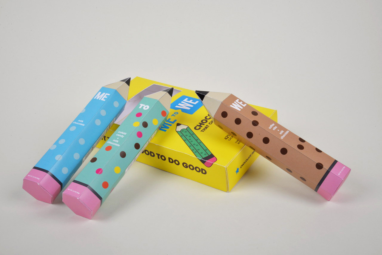
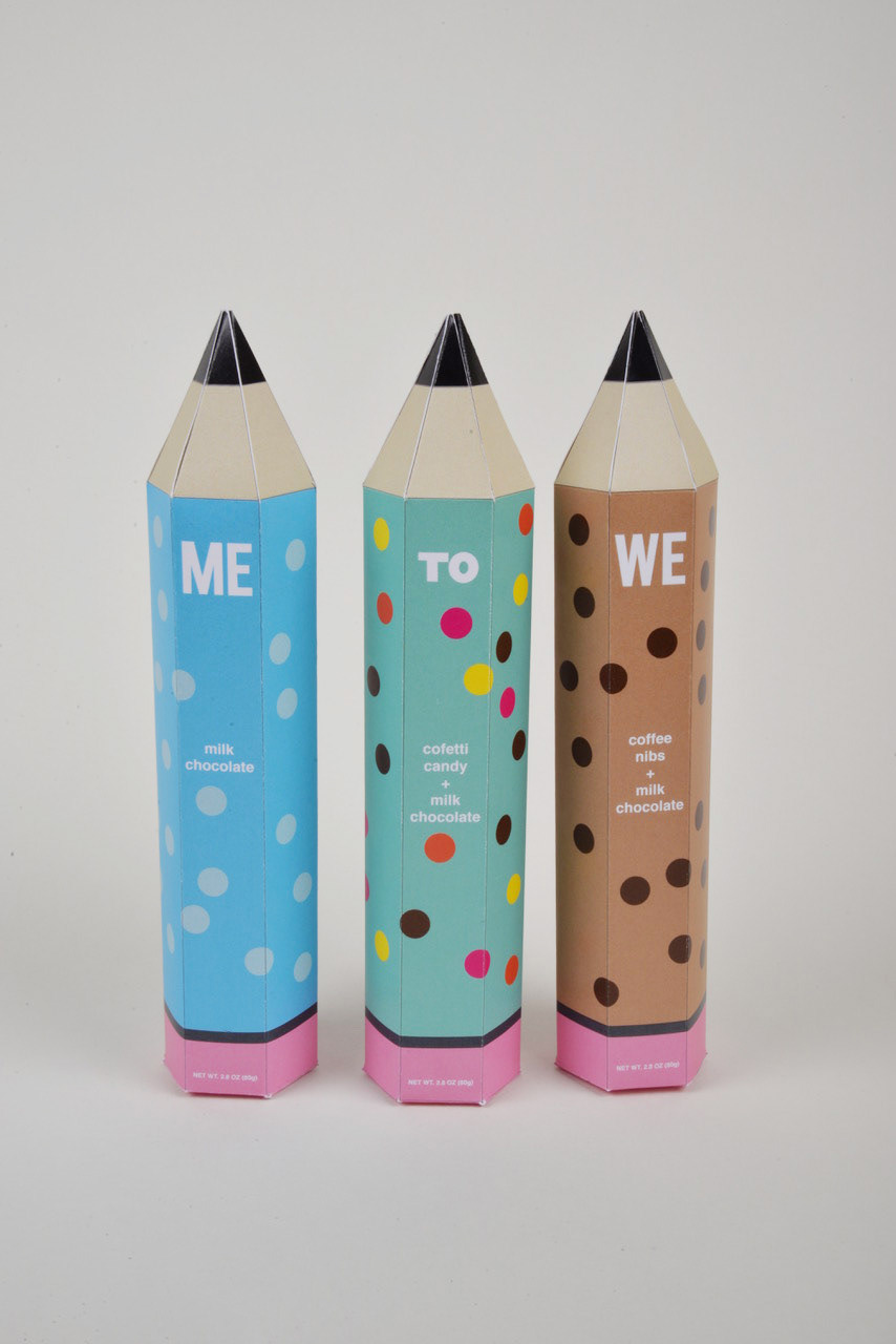
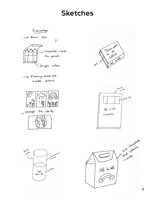
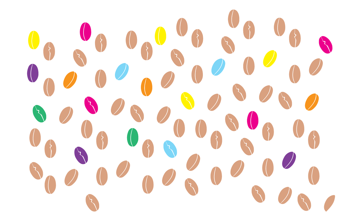
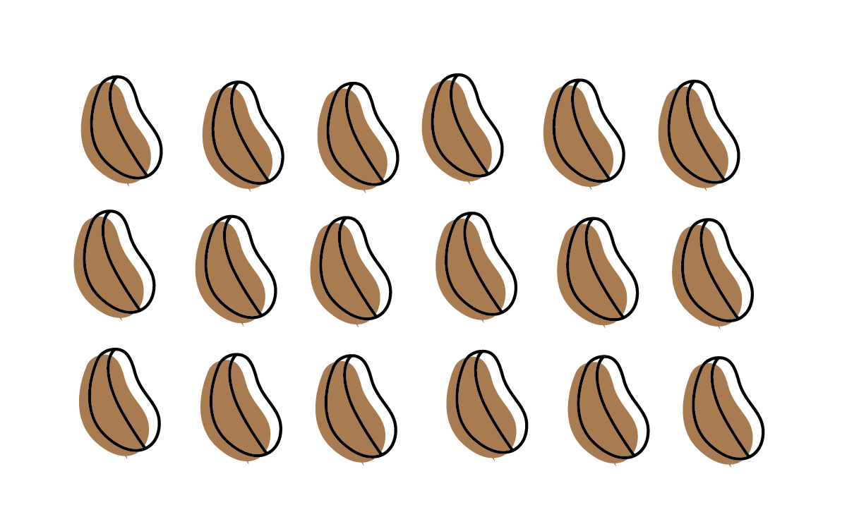
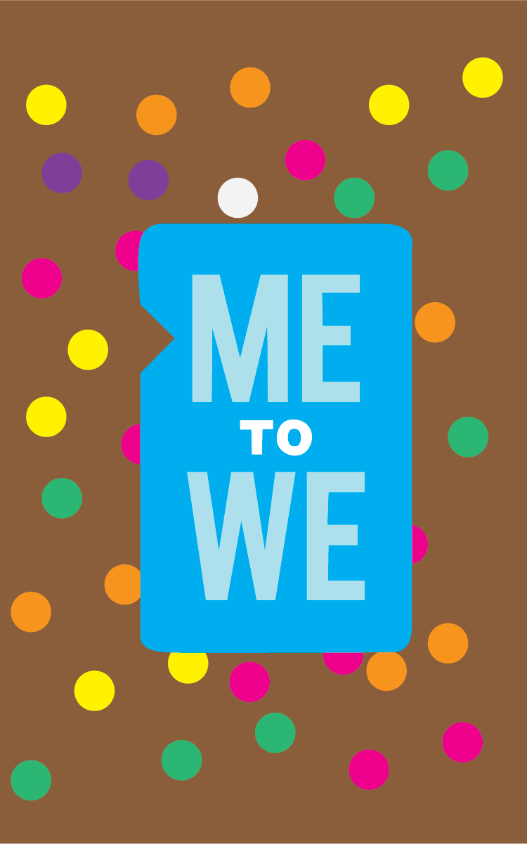
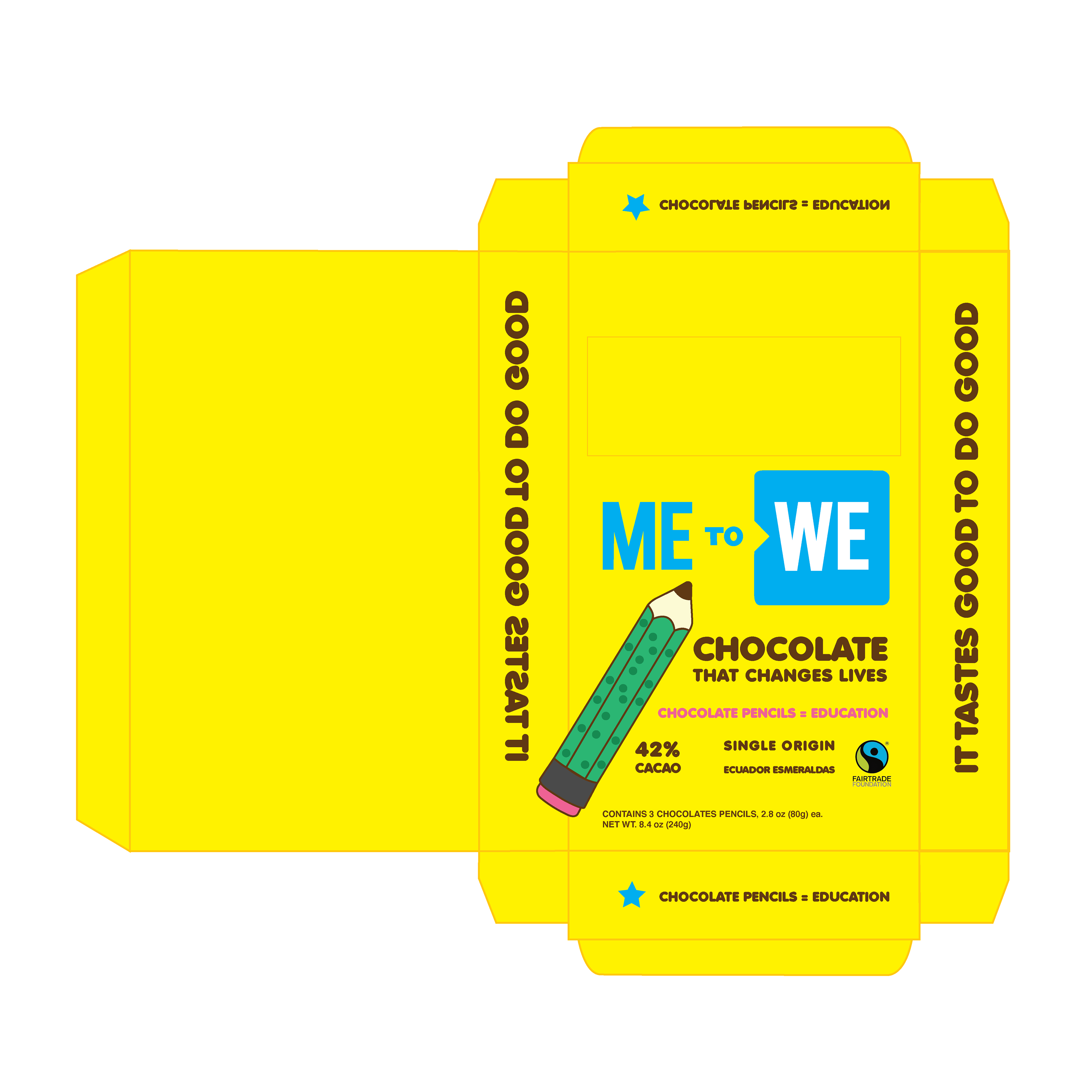
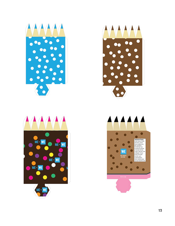
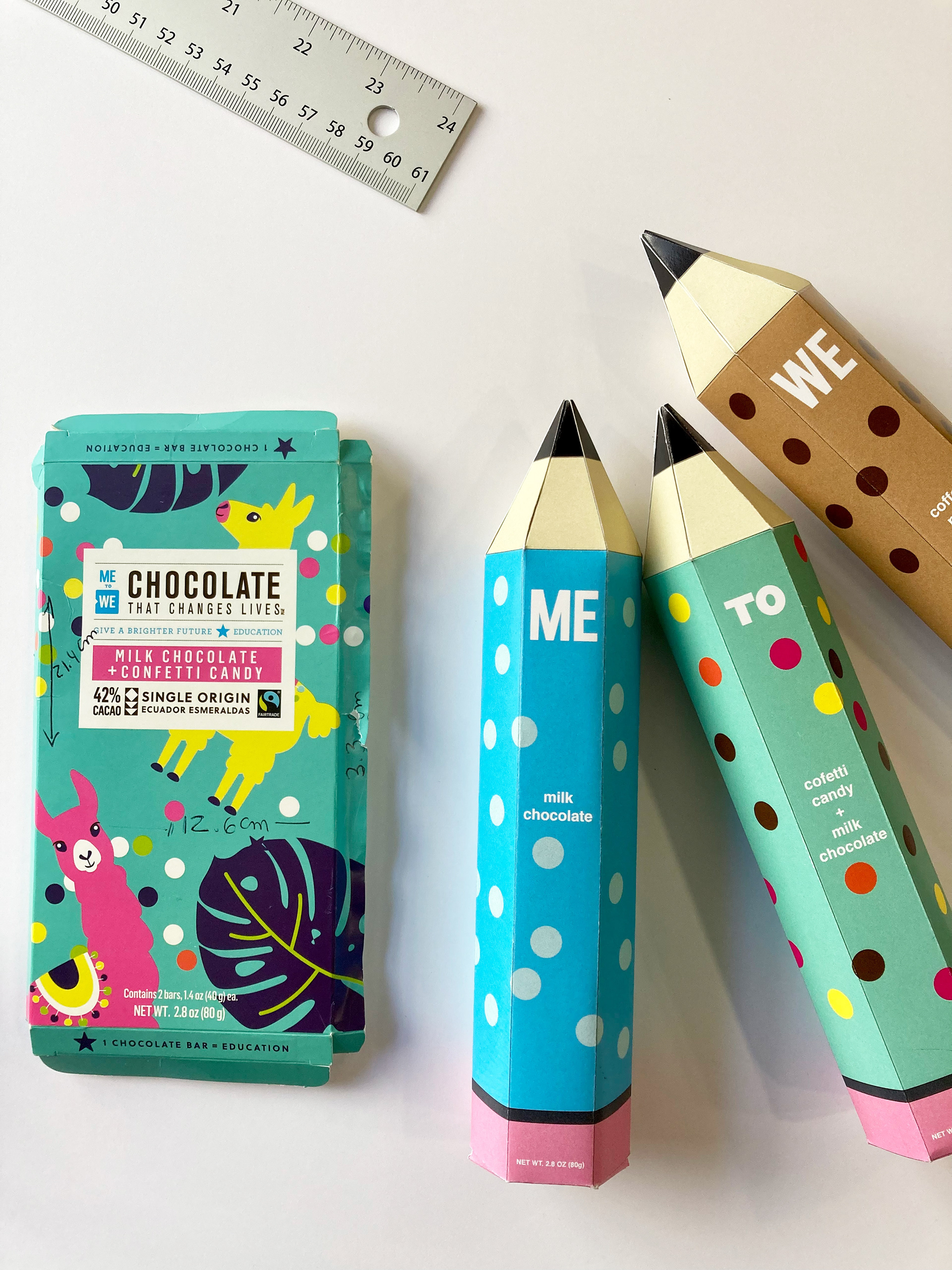
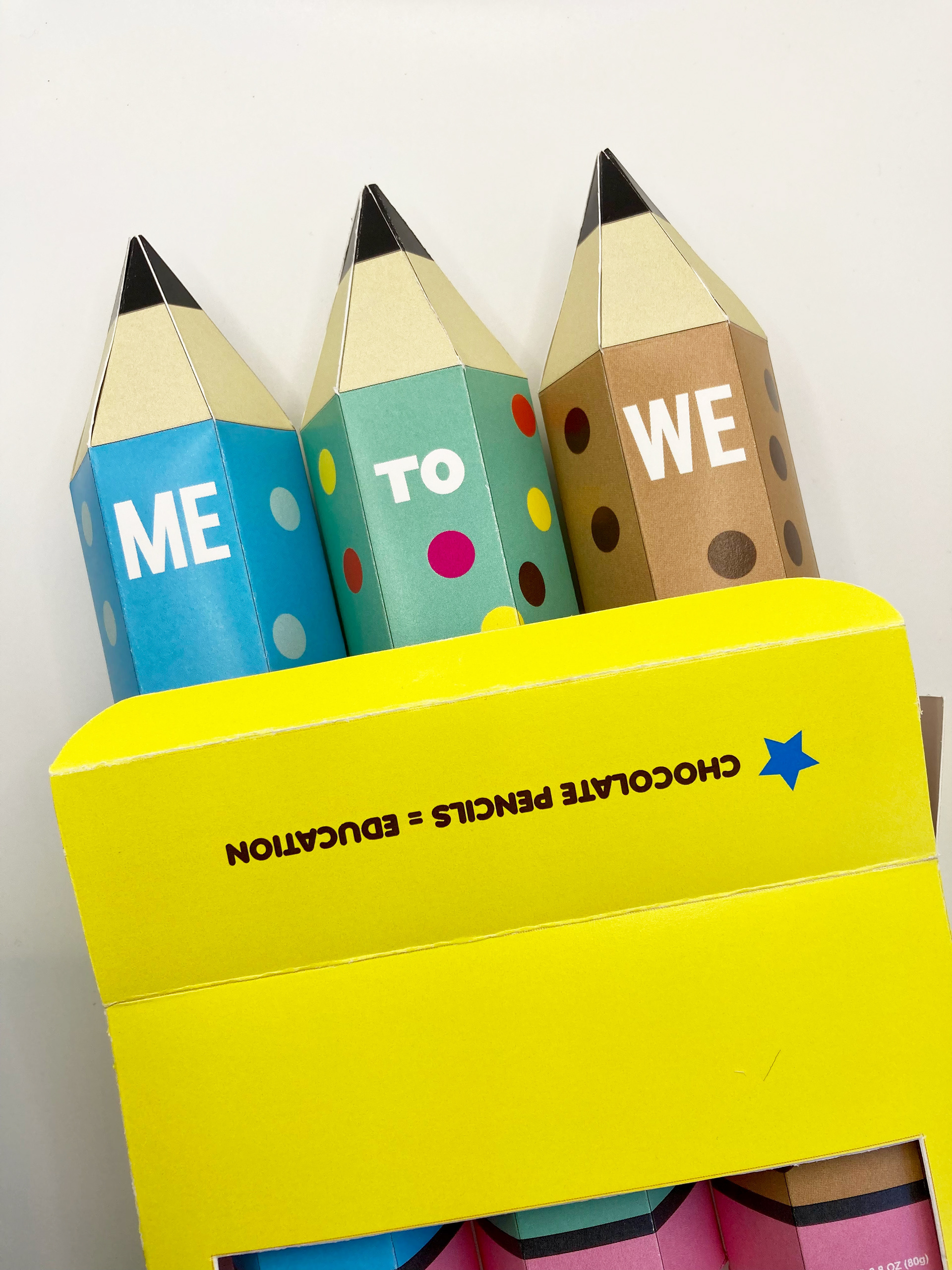
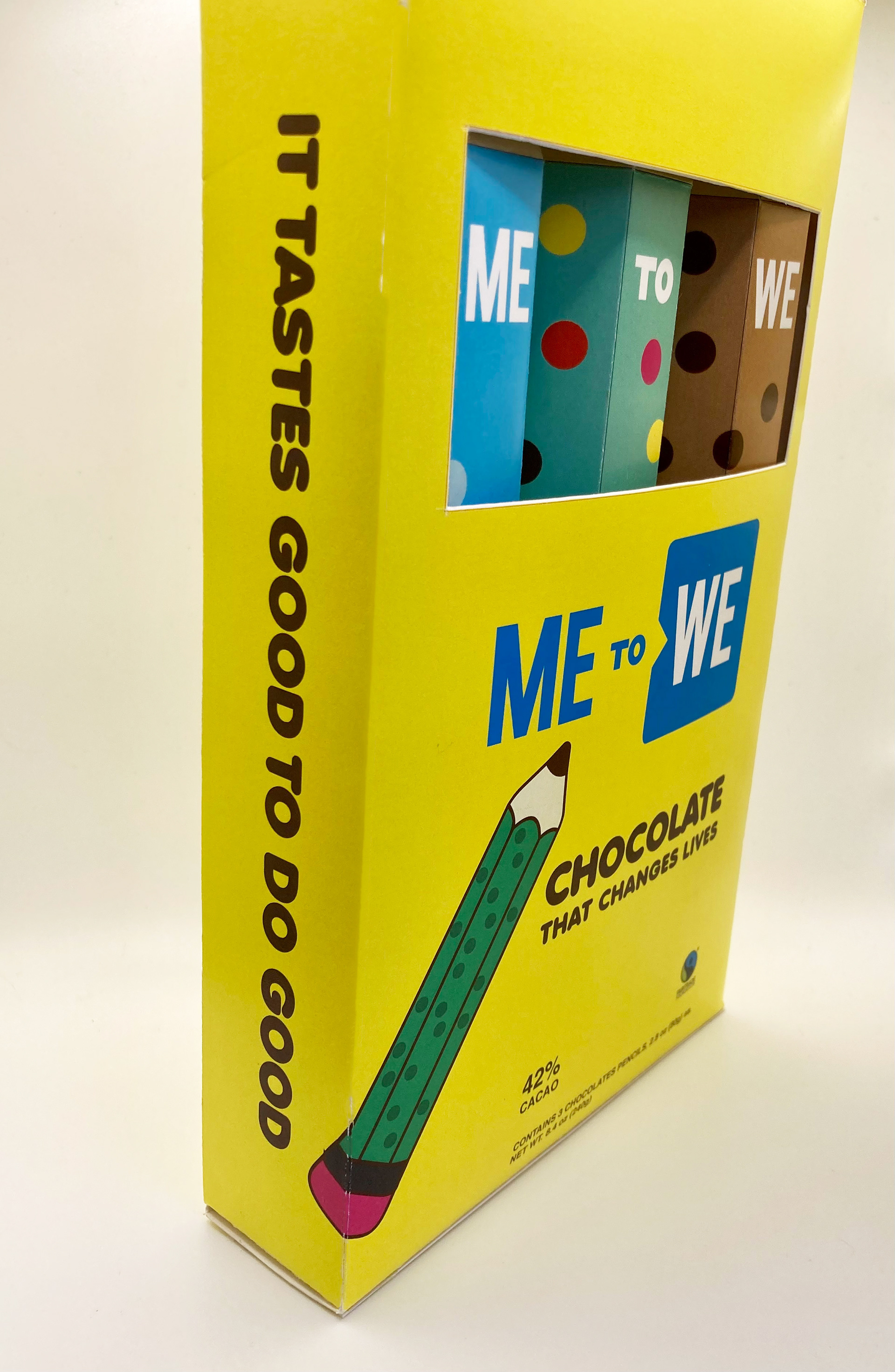
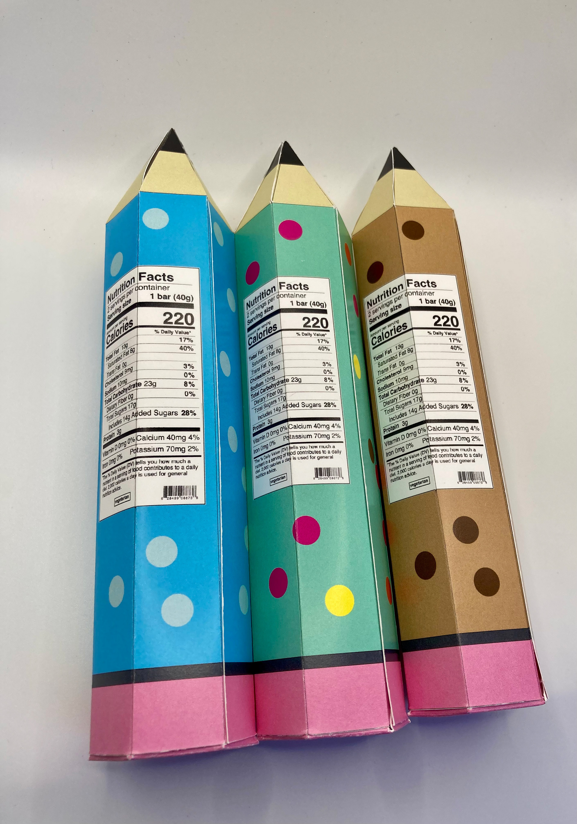
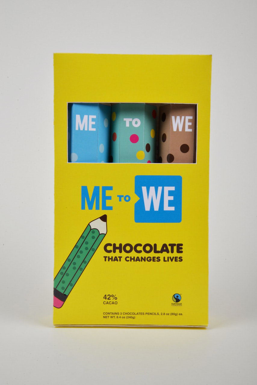
Solution: I printed the dieline and discovered that it didn’t have an opening compartment. The height and width should be customized to fit perfectly in a single box. So, the best solution was to create my own dielines for the pencils and the box. Now that I had the shapes, I explored the prints and the layouts. The polka dot print and the colors were chosen because it is playful and related to the 3 flavors of chocolate bars: confetti, coffee nibs, and milk chocolate. For the pencils typeface, Ardoise Std Compact, Anja Eliane accent Nornal, and Helvetica Bold were the best options. The last typeface was selected for having better readability in a small space. The shipper display designer solutions involved adding a die-cut on the box, as this would make the box of chocolate more like a box of real pencils; and through it, the consumer would see the words Me to We. The color yellow was adopted because it is psychologically associated with happiness, enthusiasm, and increased appetite. The illustration of a pencil is to give the consumer an idea of the content and arouse their curiosity.
Pattern & Color exploration
Pattern & Color exploration
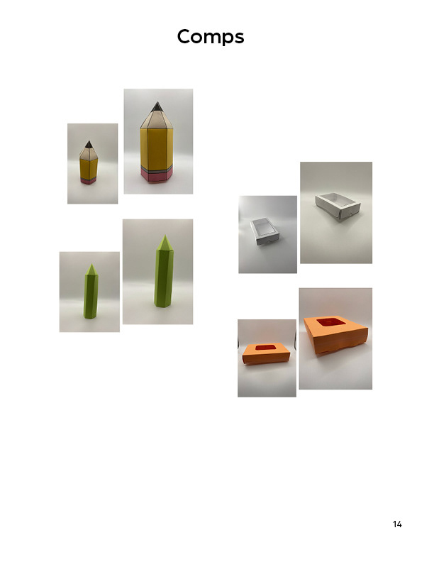
Comps
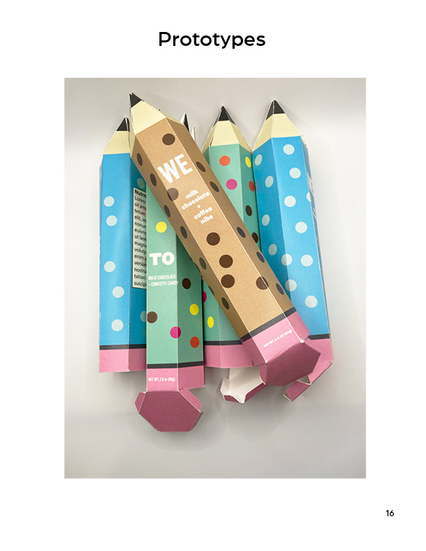
Prototypes
Prototypes
Conclusion: With this re-design process, chocolate bars evolved from simple snacks to fun and educational chocolate toys. The chocolate pencils can serve as a cue for parents to address the importance of education and conscious consumption in a relaxed conversation with their kids. “Tastes good to do good.” ME to We company No doubt, this project was super interesting and if I had more time I would create special editions of ME to We chocolate. For example, Christmas or Easter edition. It would be super fun! Truth be told, nothing better than combining fun, altruism and chocolate.
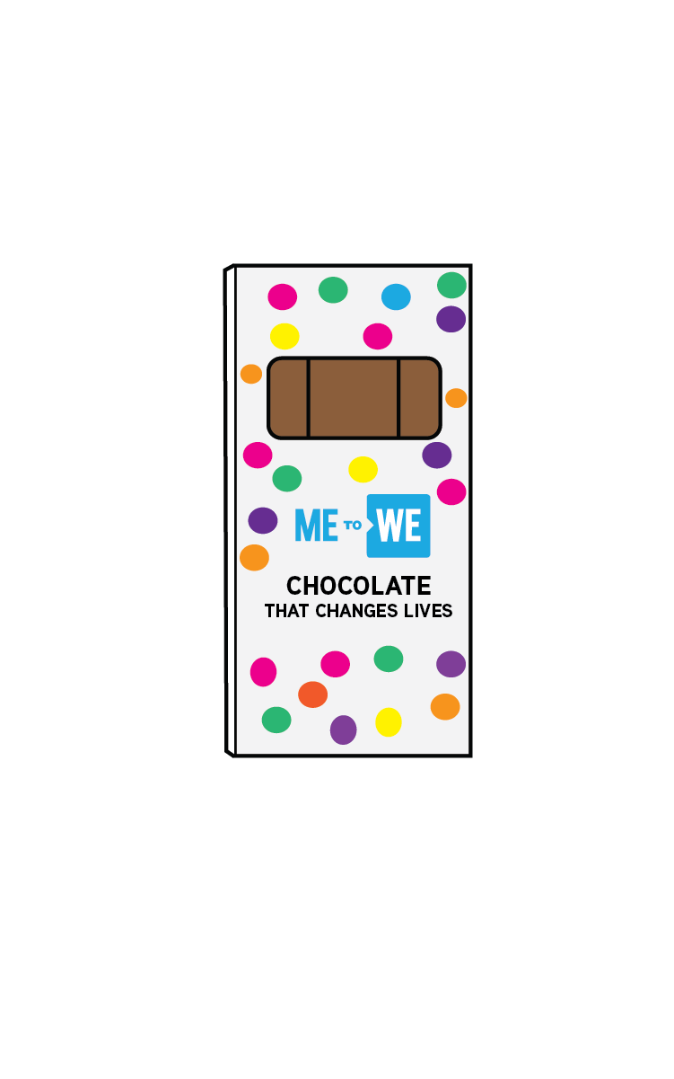
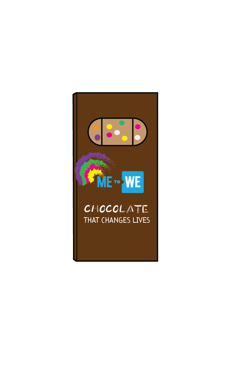
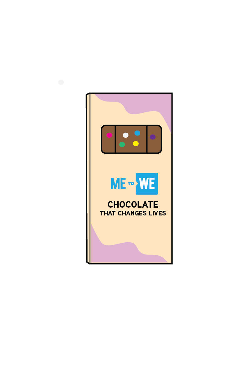
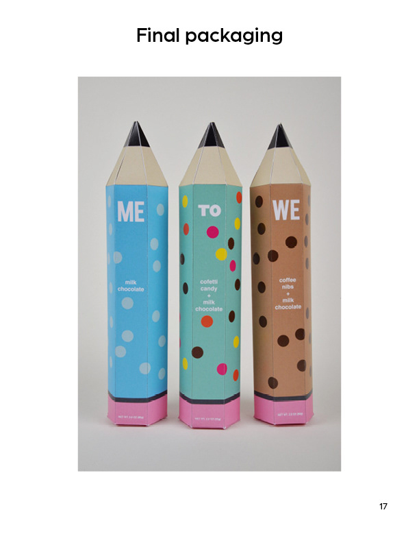
Re-designed packaging
Re-designed packaging
Re-designed packaging
Re-designed packaging
365
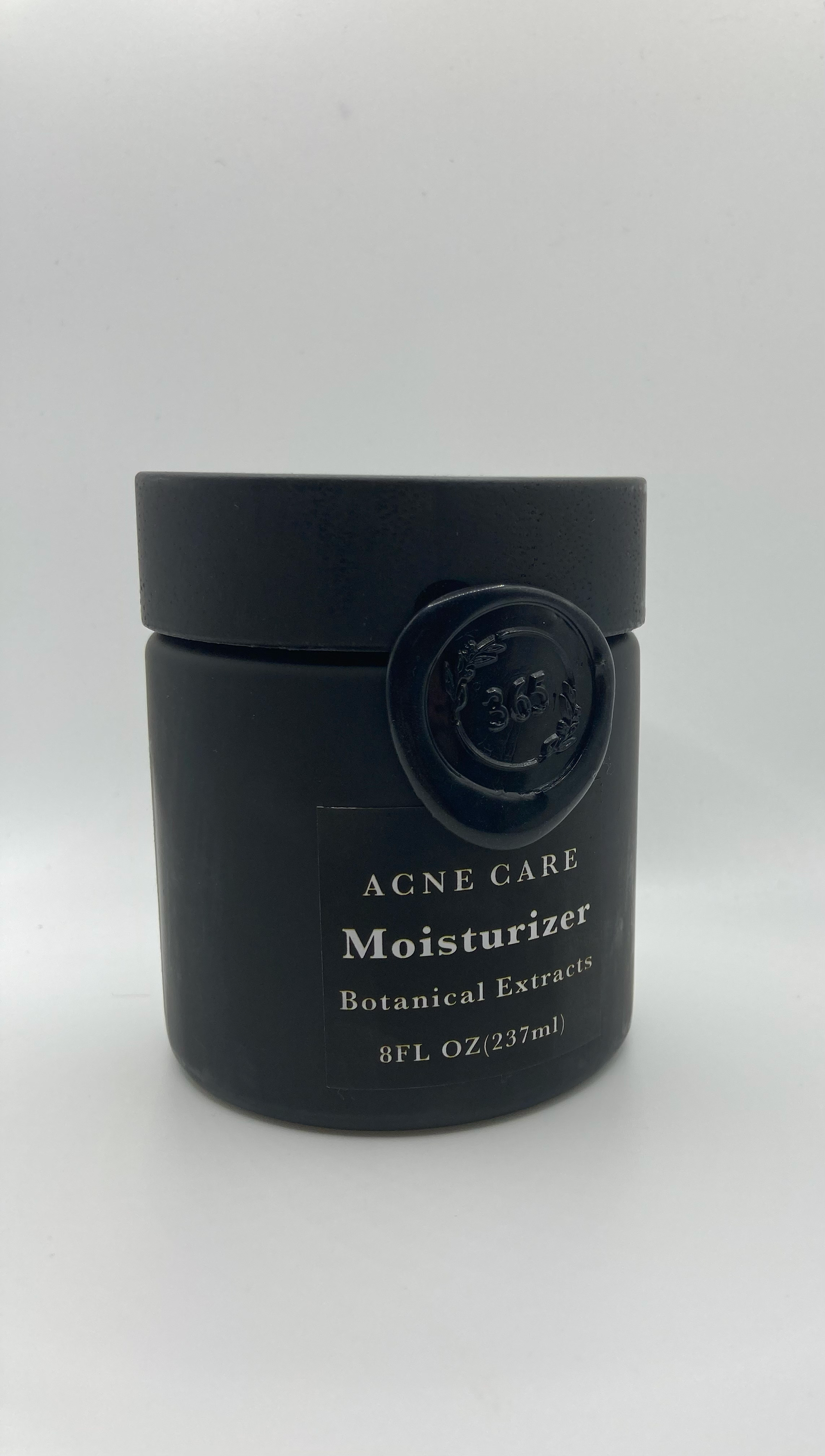
The client is 365 by Whole Foods Market, and they offer over 3,500 products. Their products are super diverse and encompass beauty and cleaning products. “Ingredients you can trust” and “Products that go the extra mile” are their slogans.
The Whole Foods company was founded in 1980 in Austin, Texas. Today, they are the world’s leader in natural and organic food. Responsible sourcing, environmental stewardship, and community giving are part of who they are and how they do business. In 2015, they launched the 365 by Whole Foods, to help meet the exploding demand for more natural and organic foods. “365” in the name celebrates our belief that fresh healthy foods can be readily available to more people in an affordable way every day…365 days a year.
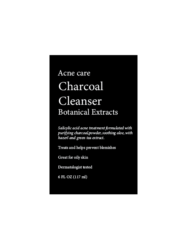
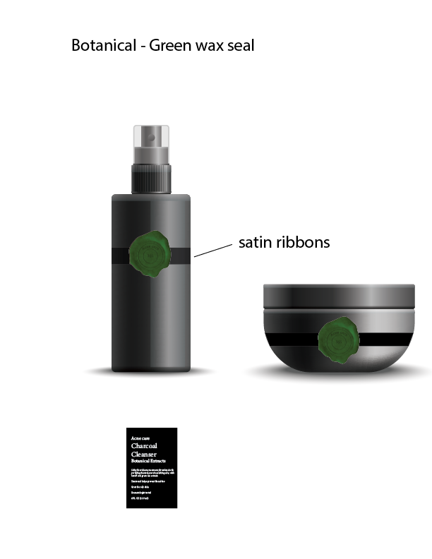
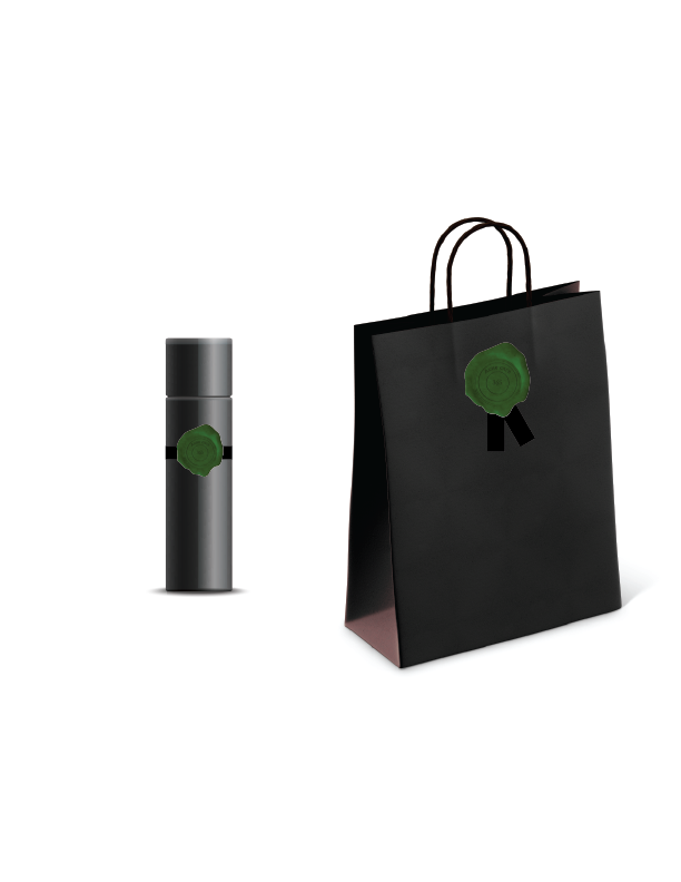
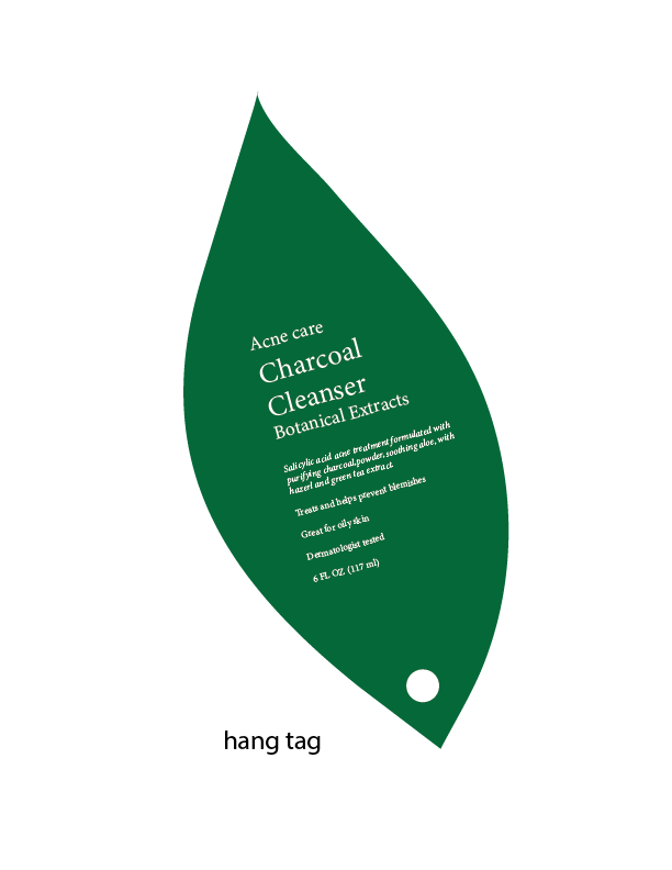
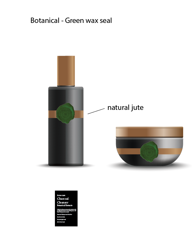
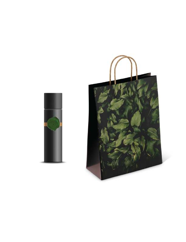
The objective of this project was to create a gender-neutral beautiful, modern and fun packaging that resonates with teenagers and adults that have acne and convey the brand’s sustainability and eco-friendly values. The new packaging will attract the attention of teenagers and their parents, be desirable, stand out, trendy, and express clean beauty. The products that were re-designed: Acne care moisturizer, Acne care charcoal cleanser, and cotton rounds.
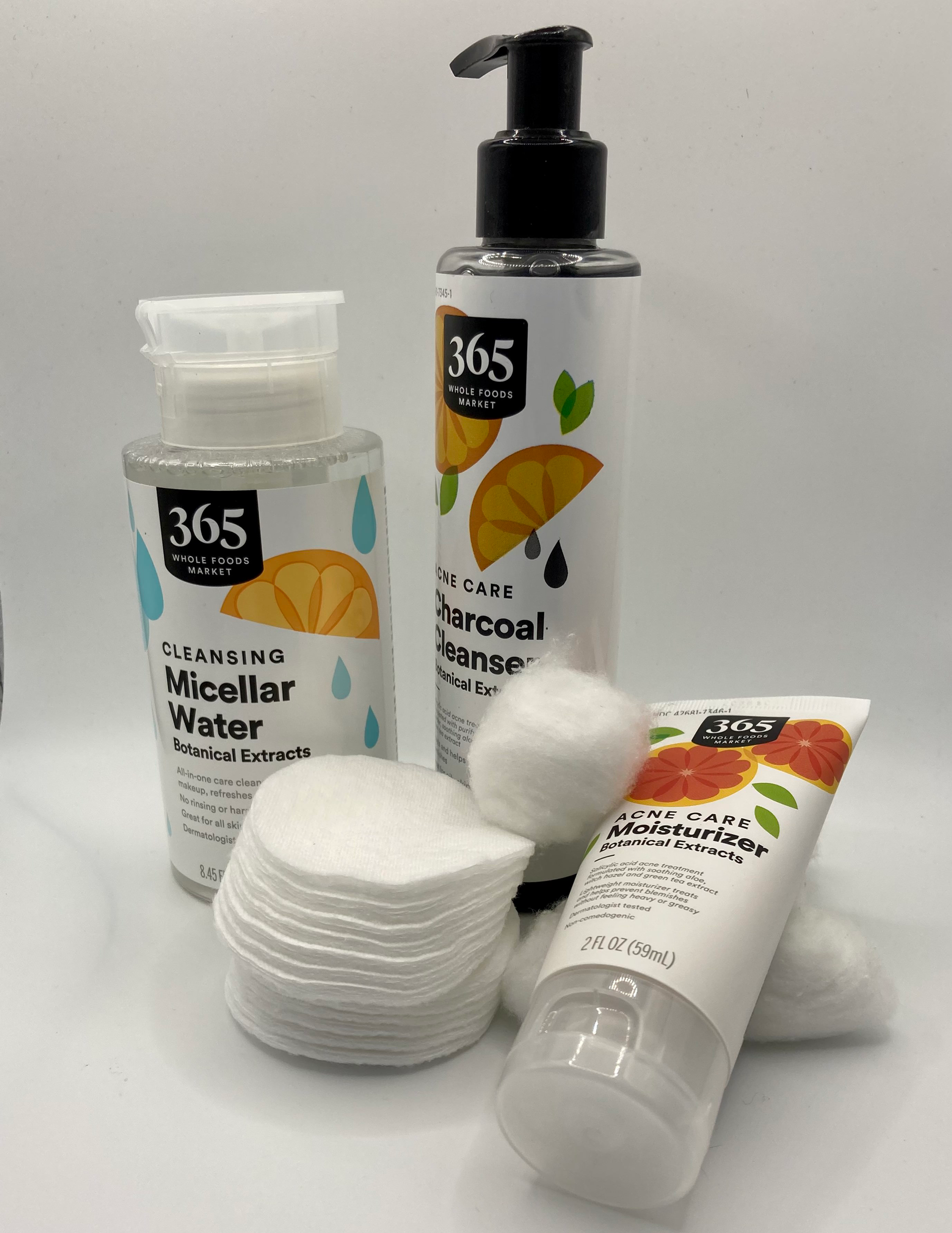
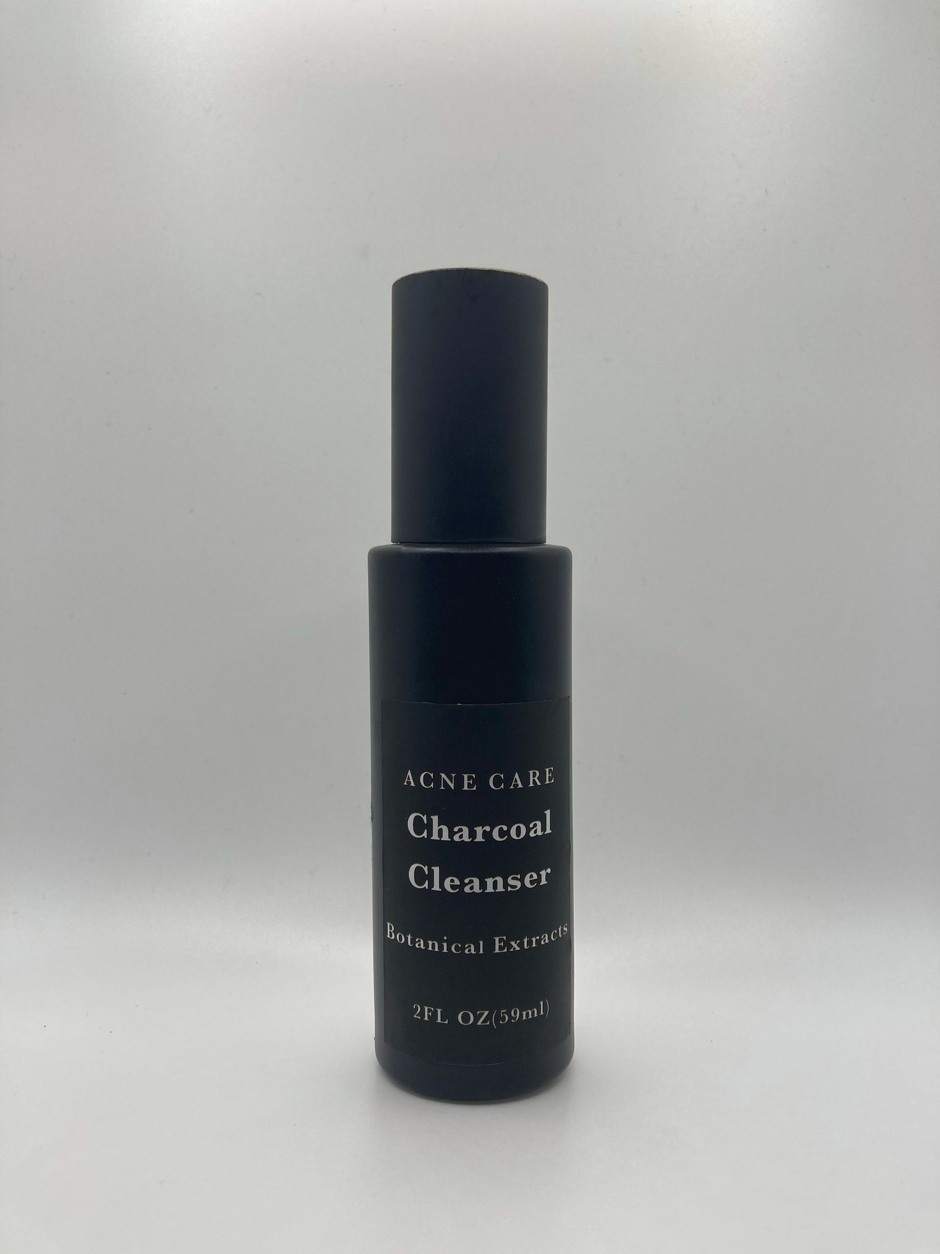
Before
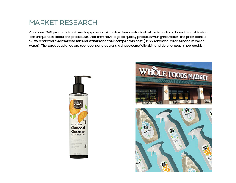
Market research
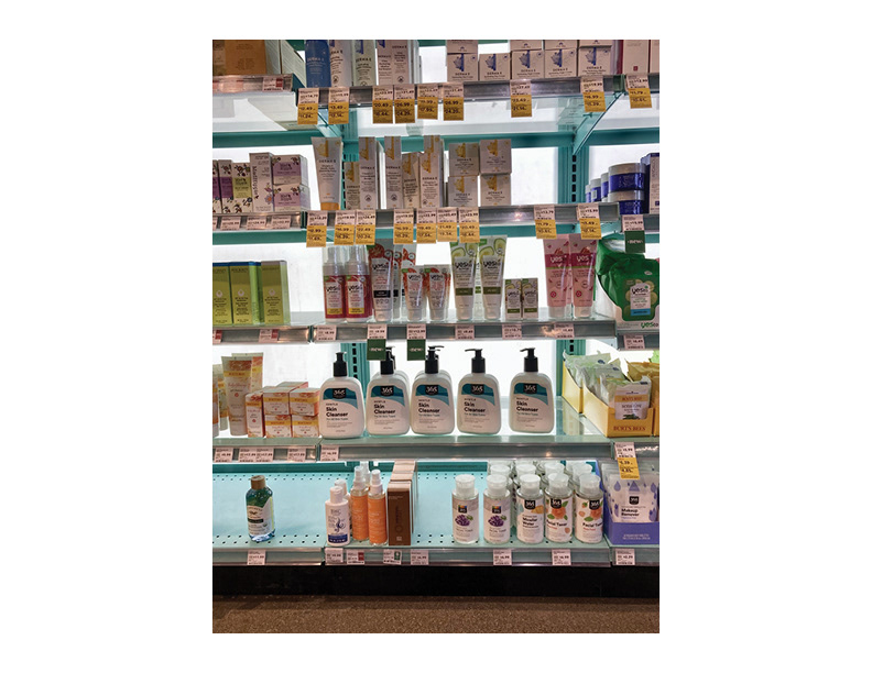
Market research
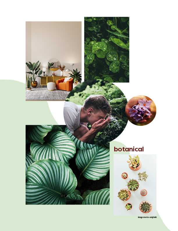
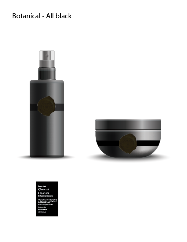
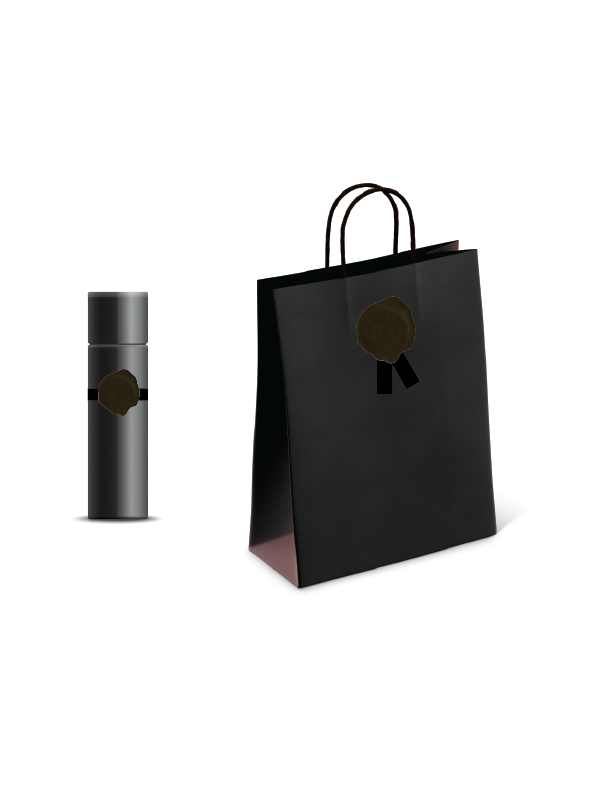
Botanical mood board
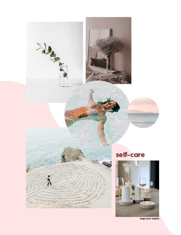
Self-care mood board
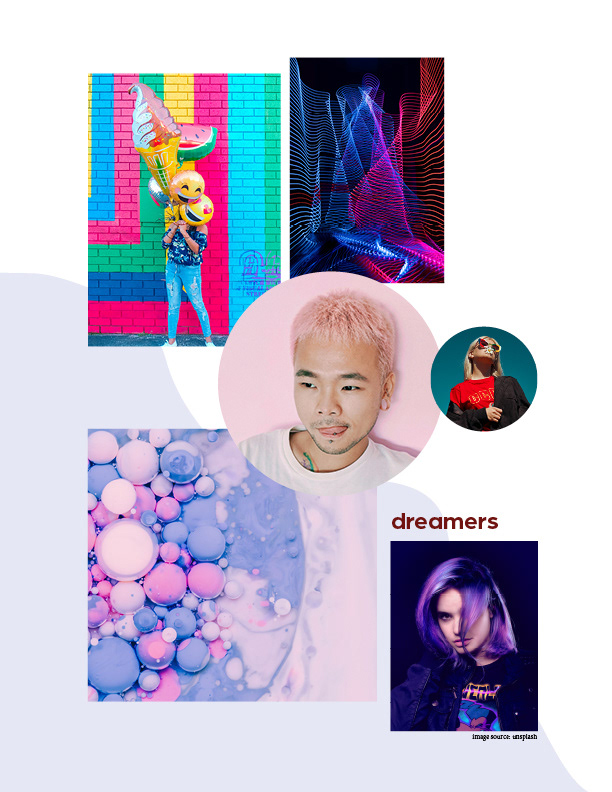
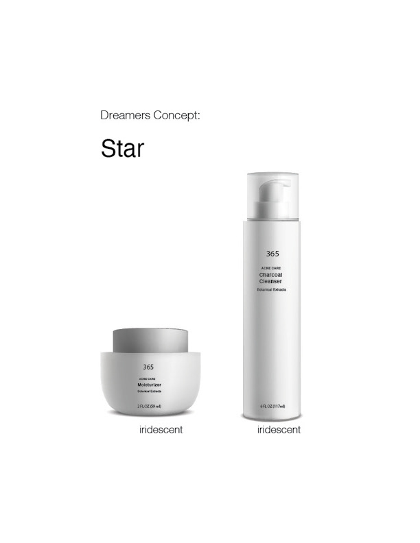
Dreamers mood board
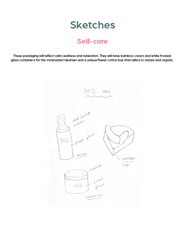
Sketches
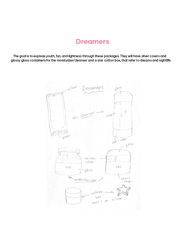
Sketches
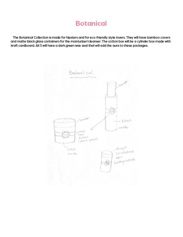
Sketches
Explorations
Explorations
Explorations
Explorations
Explorations
Explorations
Explorations
Explorations
Explorations
Work in progress
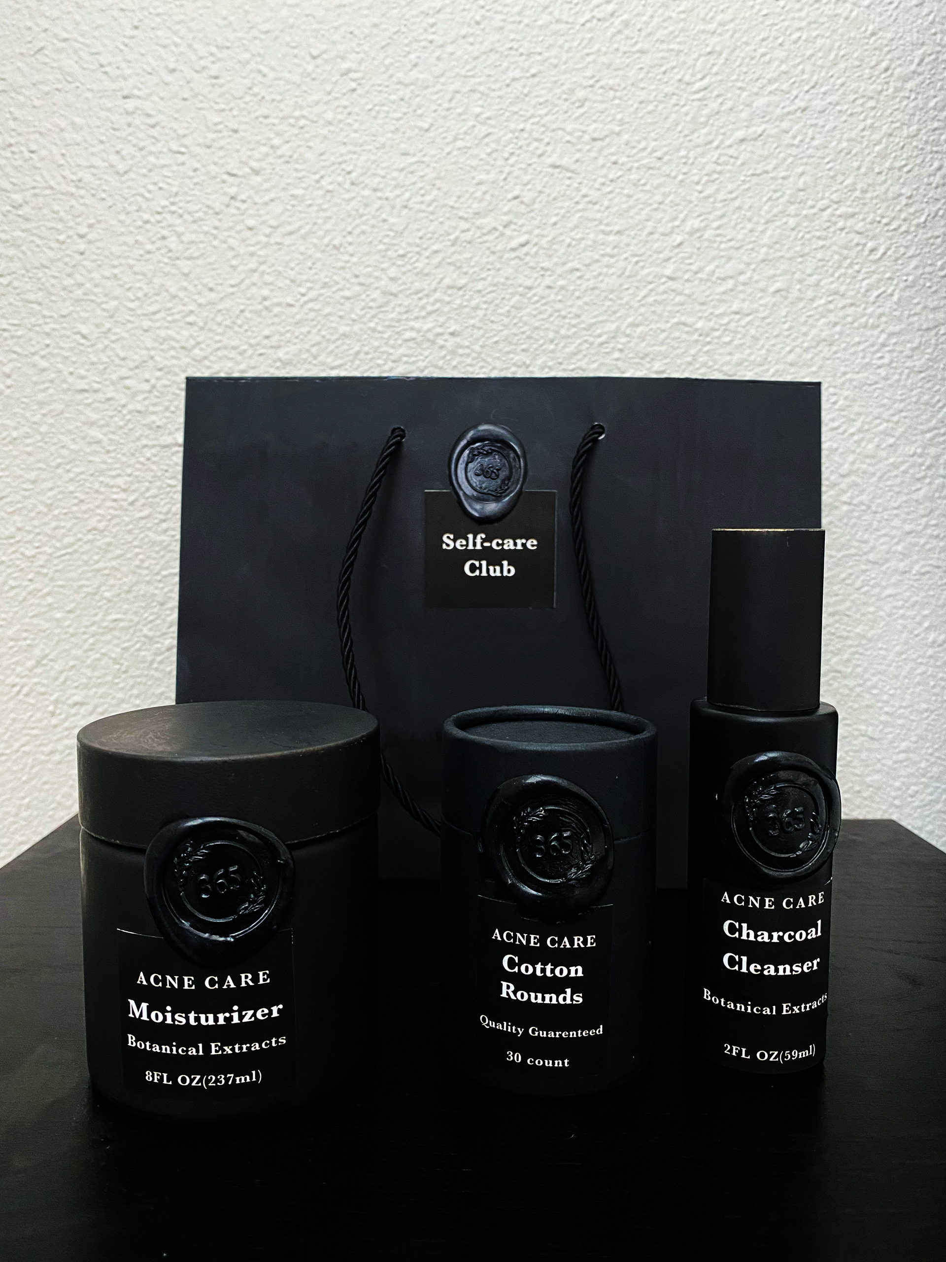
Final version